
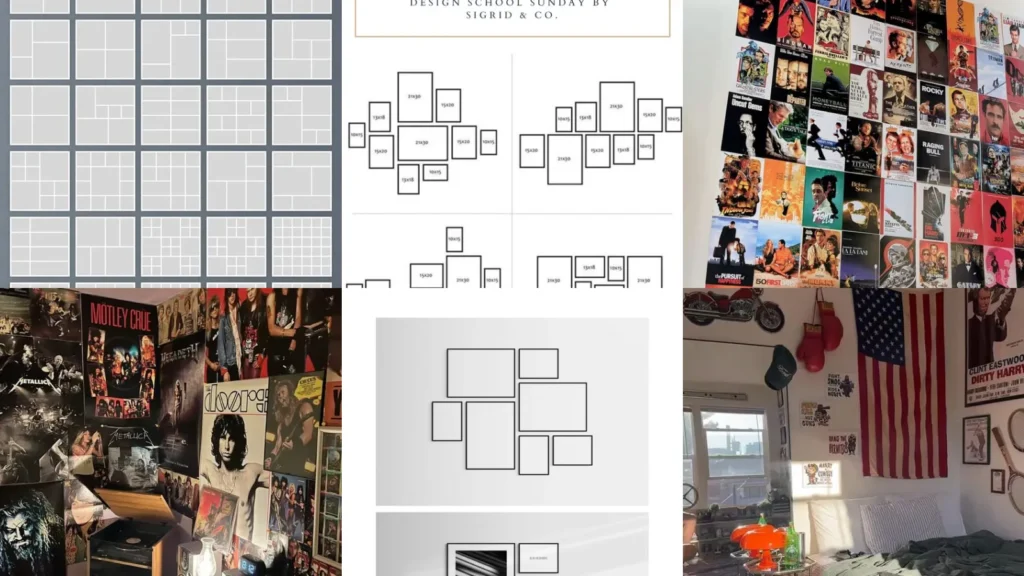

Here’s a tip nobody tells you when you start hanging posters. Leave gaps on purpose!
A wall that’s perfectly packed edge to edge actually reads as cluttered, but a little breathing room makes everything look intentional.
That one trick alone changes how a whole room feels. So does the order you hang things in, honestly.
This list pulls together 20 layouts worth scrolling past a hundred times. We looked through pin after pin and kept only the setups that are doable in a everyday rented bedroom, not just a designer showroom.
Some need a level and a little patience. Others come together in twenty minutes with nothing but tape.
Either way, nothing here needs a huge budget or a drill full of confidence you don’t have yet, lol!
Scroll through, save your favorites and mix a couple together if you want. That’s honestly how the best walls happen anyway.
POSTER LAYOUT IDEAS WALL
Grid Poster Wall Layout
Grid layouts are the safest bet if you want things to look sharp without much guesswork. Even spacing and matching sizes do all the work here.
Measure once, mark your spots with painter’s tape and hang everything to the same line. It’s foolproof, honestly.
- Grid math made easy
- Same gap every time
- Works on any wall size
- Looks sharp in minutes
Asymmetrical Poster Arrangement Idea
Not everything has to line up. That’s the whole charm of an asymmetrical layout.
Posters of different sizes get scattered at slightly different heights.
It looks like it happened naturally, but there’s usually a plan hiding underneath. Start with your biggest piece and build outward from there.
- Organized chaos wins
- No ruler required
- Great for odd wall shapes
- Fills space fast
Staircase Poster Wall Layout
This staircase layout follows the actual stairs, which sounds obvious once you see it done well. Each poster steps up or down with the incline.
It turns a boring stairwell into the most photographed spot in the house. Nobody expects a hallway to have this much personality!
- Stairwells deserve art too
- Follows the incline exactly
- Uses spare frames you own
- A weekend project, easily
Minimalist Single Poster Display
Sometimes one giant poster says more than twelve small ones ever could. This minimalist approach is for the person who hates clutter, plain and simple.
Pick a piece with strong color or a bold graphic. It should be able to hold the whole wall by itself, no backup needed.
Overlapping Poster Wall Design
Overlapping posters give off that lived-in dorm room energy without looking messy. Layer a smaller print halfway over a bigger one and let the edges touch.
It works best with pieces that share a color palette, so nothing fights for attention. Cheap poster tape is basically all you need for this one.
Read also: 20+ Genius Poster Frame Hacks Cheap That Transform Your Walls
- Layers over lineups
- Costs almost nothing
- Hides wall damage underneath
- Casual and cool instantly
Diagonal Poster Layout Idea
A diagonal run of posters pulls the eye across the room instead of straight up and down. It’s a small shift that makes a huge visual difference.
Angle each frame the same few degrees so it reads as a pattern, not an accident. This one photographs beautifully, by the way.
- Angles change everything
- Same tilt on every frame
- Great above a headboard
- Reads as a pattern
Ceiling To Floor Posters

Who says posters need to stop at eye level? Running them ceiling to floor turns one wall into a full statement piece.
This works best on a wall without much furniture in the way. It makes low ceilings feel taller too, which is a nice bonus nobody mentions.
Salon Style Poster Wall
Salon style hanging is the old gallery trick where frames of all shapes crowd together like a real art museum wall. Mismatched frames actually help here instead of hurting.
Read also: 18+ Budget Wall Art Ideas Men That Look Expensive
Group by color instead of size and the whole thing pulls together on its own. This is the layout for anyone with a growing poster collection and no plan to stop, haha!
- Mismatched frames welcome
- Group by color, not size
- Grows over time easily
Vintage Movie Poster Collage
Vintage movie posters bring instant character to a plain wall. Look for reprints of classic films from thrift stores or estate sales.
Read also: 20+ Genius Thrift Store Finds Ideas Men Actually Want
The slightly worn paper edges only add to the look. Frame them cheaply and let the artwork do all the talking.
Cult Classic Movie Posters
Cult classics have some of the best poster art ever printed, honestly. Bold fonts, strange illustrations, colors nobody would pick today.
Hang a handful together and the room instantly feels like it belongs to someone with actual taste. Who doesn’t love a wall that starts conversations, am I right?
Horror Movie Poster Corner

A horror corner is one of my favorite movie poster wall ideas for anyone who loves a little spooky energy year round. Group the creepiest posters together in one dedicated section instead of spreading them out.
Read also: 14+ Spine-Tingling Horror Movies PFP That Scare Followers
It reads intentional instead of random that way. Black frames make the whole corner feel a bit more sinister too.
- The spooky corner fix
- Groups the eerie things together
- Black frames add drama
- Small space, big mood
Retro Band Poster Wall
Retro band posters instantly age a room in the best way. Think concert flyers from decades before you were even born, faded colors and all.
These band poster room ideas work especially well layered slightly overlapping, like they’ve been added to over years.
Concert Poster Display Idea
Concert poster displays feel personal in a way store-bought art never quite does. Every ticket stub and setlist tells its own little story.
Pin them up loose or frame the favorites. Either way, this wall only gets better with time.
- Every show gets a spot
- Loose pins work fine
- Frame just the favorites
Rock Band Poster Bedroom
This rock band bedroom setup goes big and doesn’t apologize for it. Oversized posters, a couple of vinyl records nailed up and maybe a string of lights across the top.
Read also: 20+ Stunning Poster Grid Wall Ideas That Transform Rooms
It’s loud in the best way. Not everything in a bedroom has to be soft and neutral, lol!
Black Frame Gallery Wall
Black frames pull together a wall of totally random art like nothing else. Matching frame color is the one trick that always works, no matter what’s inside them.
Buy a batch of the same cheap black frames and swap the art out whenever you get bored. Same wall, brand new look.
- One frame, endless art
- Swap art anytime
- Ties mismatched pieces together
Mixed Frame Sizes Display
Mixing frame sizes keeps a wall from feeling flat. This is genuinely one of the easiest frame gallery ideas guys can pull off with things they already own.
A few small squares next to one big rectangle adds real rhythm. Nothing has to match perfectly here, which honestly takes the pressure off.
Masculine Frame Gallery Layout
This masculine layout leans into darker tones, straight lines and almost no clutter. Think fewer pieces, bigger impact, everything spaced with real intention.
It’s the setup for someone who wants a wall that looks put together without trying too hard. No shame in that.
- Fewer pieces, more impact
- Dark tones throughout
- Wide spacing between pieces
- Minimal but confident
Tapestry Flag Wall Display
A tapestry adds texture that flat posters just can’t match. Drape it wide across a headboard wall or pin it flat like a giant piece of art.
It also covers a lot of wall fast, which is great if you’re short on other decor. Same!
Sports Flag Wall Corner
Sports flags are the fastest way to claim a corner as your own. Hang a favorite team flag with a couple of smaller pennants underneath for that stadium feel.
These flag wall ideas room setups work great above a desk or a gaming chair too. Talk about school spirit that never has to end!
Layered Flag And Poster Wall
Last but definitely not least, we have this layered flag and poster combo. Flags add color blocks behind smaller framed pieces, so the whole wall gets extra depth.
Start with the flag flat against the wall and build the posters on top slightly off center. It’s a lot of visual interest for very little cost.
- Depth without the drama
- Flag goes down first
- Posters layered on top
- Big look, small budget
Just a little note - some of the links on here may be affiliate links, which means I might earn a small commission if you decide to shop through them (at no extra cost to you!). I only post content which I'm truly enthusiastic about and would suggest to others.
And as you know, I seriously love seeing your takes on the looks and ideas on here - that means the world to me! If you recreate something, please share it here in the comments or feel free to send me a pic. I'm always excited to meet y'all! ✨🤍
Xoxo Giulia
Related stories